Machine-Learning-Projects
This project is maintained by manish246
Machine-Learning-Projects
Project 1: Analyzing Covid-19 Deaths in Patients with Different Conditions among Various Counties in the United States of America.
The Project contains different Python Notebook files as shown below:
- x19229887_Dataset1_DAP.ipynb
- x19229887_dataset2_dap.ipynb
- Joined_Datasets_Model_Buildup_Visulaization.ipynb
- Master_Python_Notebook.ipynb
The 3rd and 4th Notebook files are “x19229887_Dataset1_DAP.ipynb” and “x19229887_dataset2_dap.ipynb” which conatined seprate datasets on which analysis has been performed individually.
- In the both file API is being called for fetching the data.
- Used MongoDb Atlas has been used and Codes are reproducible and for security purpose we have configuration file so that username and password are not accesible to outsiders.
- PostgreSQL has been hosted on Microsoft Azure and for security purpose we have used Configuration file where parameters are passed so that username and password are not accessible to outsiders.
database.ini file contains Initialization parameters which will be read by config.py file which contains parameter for connection strings to connect to the PostgreSQL hosted on Azure and Mongodb Atlas. We have to import both of these files before running the python notebook files.
Joined_Datasets_Model_Buildup_Visulaization.ipynb contains the Team co-ordination task of joining different tables to get a final table and thus applying a model as well as visualizing the same.
Finally the Master_Python_Notebook.ipynb contains the code to execute the entire code suite, thus hassling away to execute the files to be run individually.
Overview of the project:Projects Aims at finding the Total no of deaths in united states of America due to covid and the afctor influencing it.
Exploratory Data analysis
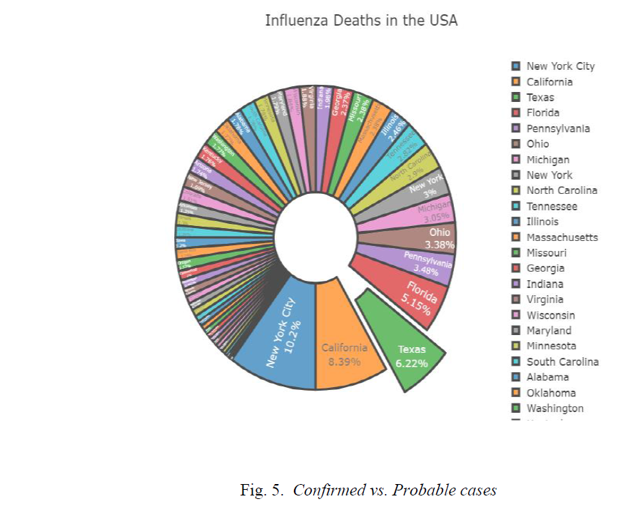
New York City has highest no of Deaths due to influenza which was around 6411 followed by California which accounts to 5470 deaths due to influenza. The Texas state has the 3rd highest deaths in U.S.A. below Pie chart as shown in Fig. 5. drawn with the help of Plotly libraries shows the same. From the Pie chart also, we can conclude the same as its clearly visible New York City Contributes 10.2 percent of the total influenza deaths followed by California which accounts for 8.9 percent of the total deaths due to influenza.
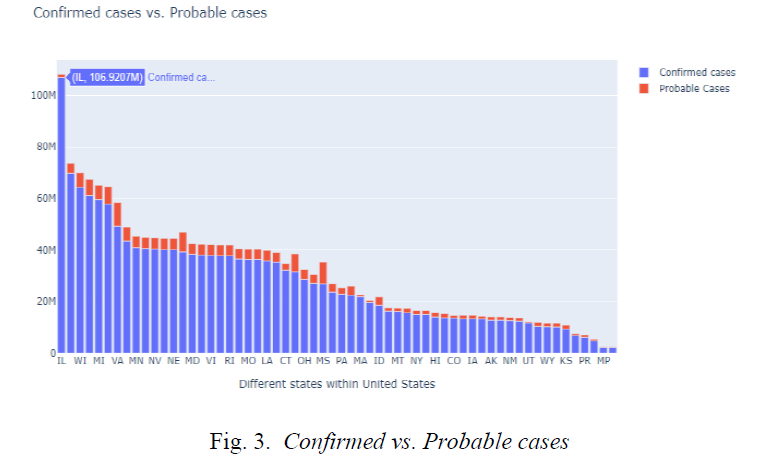
Illinois has the highest number of Confirmed cases with numbers exceeding more than 100 million, but has a lower number of Probable cases, whereas on the other hand Virginia with the state code VA has a large number of Probable cases close to 9 million as shown in Fig. 3.
We have Chosen Multi linear regression Model as we have many predictors and our intention to predict to new probable cases. We have got Adjusted R square of More than 90 percent.
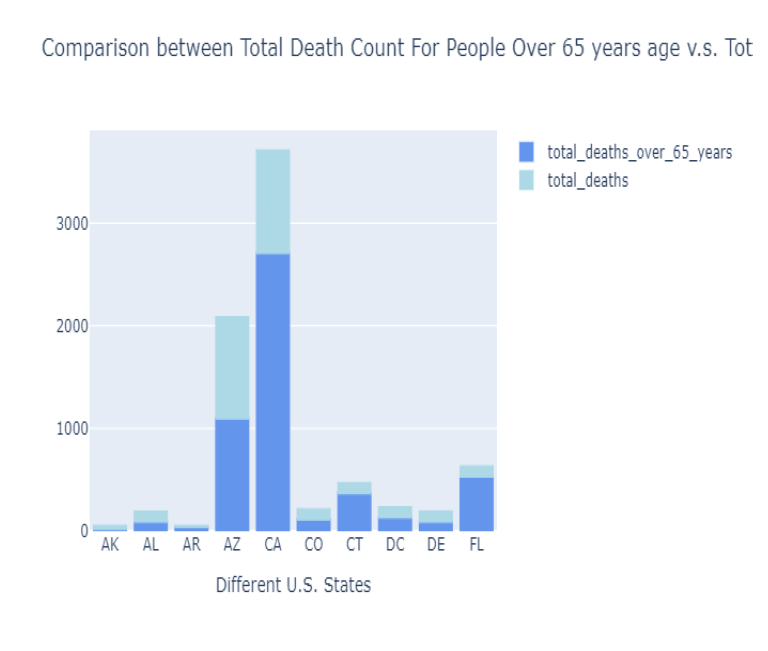
Increasing rise in covid-19 cases, deaths, probable cases and deaths has huge implications on the particular county, as more and more peoples get infected, the virus starts to mutate and become resistant to vaccinations. The analysis we did showed that among different states as shown in Fig. 12. , the total deaths among peoples over 65 years is highest in California, followed by Arizona implicating that elderly persons are more impacted by virus.
Conclusions
From the Analysis we can Predict that California state has maximum no of Covid 19 deaths also it has second highest death counts for various other diseases like Pneumonia and Influenza. The most interesting finding is California also accounts for maximum no of death count of elderly people of Age more than 65 years due to Covid.
Project 2:Analysis of Time series and Logistic Regression using R
Assessment of the components of the raw time series
The Project contains different Python Notebook files as shown below:
- Arima Model.R
- Holt_model.R
- Holt_winter_model.R
- Naive model.R
- SES model.R
- R file with pCA.R
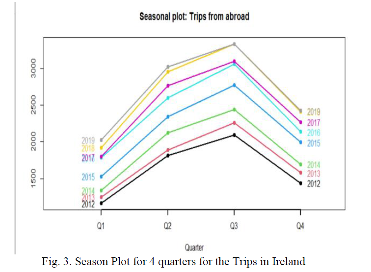
Note:The Fig. 1. shows of raw time series data which depicts a trend with gradual increase in Trips from abroad. The Centre moving average plot removes effect of seasonality to show clear increasing Trend. The plot not only shows the trends also shows for better forecast we have to consider seasonality and trends both in this case
From September month there is gradual decrease in the number of Trips in Ireland from abroad. Also, one more interesting finding is the no of trips to Ireland is increasing from 2012 to 2019.
SIMPLE EXPONENTIAL SMOOTHENING
The first model which we have implemented is simple smoothening model (SES) in our Overseas Trips Dataset. The SES is used where there is no trend or no season effect, but as discussed above we have both trends and season present in our dataset.first we have to remove that for that we have first find out the order of differencing in Training set which can be find out by ndiff function.
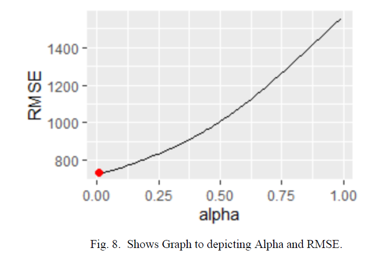
We have to find the minimum value for smoothening parameter in our model for which we have used loop. We are passing the value of alpha from 0.01 to 0.99 to get the value of alpha at minimum RMSE The value of alpha which we got from the loop is 0.01 and a minimum RMSE of 734.We have also plotted graph Minimum alpha at minimum RMSE. The Fig. 6. Shows the same in which we can see that we are getting alpha as 0.01 at 734 RMSE
HOLT’S METHOD
In holt method we will consider the Trend component of the Time series data which was not there in SES model, to apply this technique we will consider only trend component not seasonality. We have two smoothening parameter Alpha and Beta which is Level and Trend component, Respectively. For using Holt, we will holt function which is holt ().
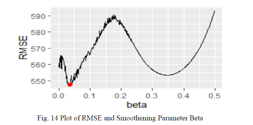
We have also plotted the Graph in Fig. 15. for for Beta minimum and RMSE at that smoothening parameter and it can clearly visualize the beta value which we have is 0.034 at RMSE value of 547
of the Models for Overseas Trips Data
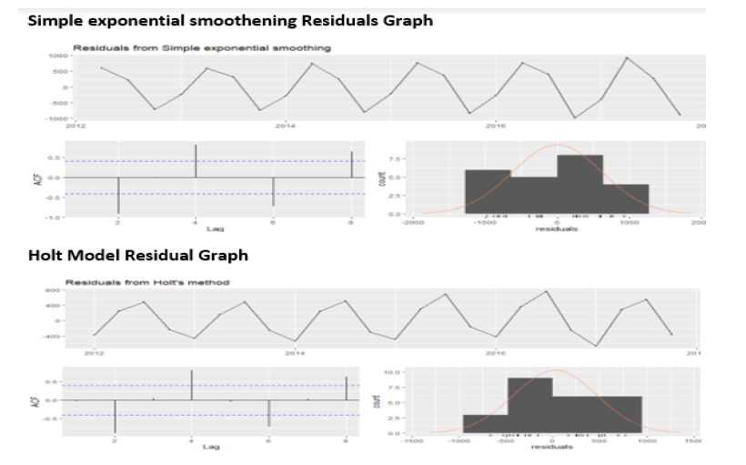
For comparing the Model, we have plotted the check residual graph for each model, and we have compared the ACF graph in each model. In SES and Holt Model have spike crossed the dash lines which means Auto Correlation exist and in Holt Winter Model we can see none of the spikes touches the dashed line means there is no auto corelation in the Holt-winter Model. So, from this point of View the Holt winter model is best. Fig. 24 shows the same.
Logistic Regression on childbirth in USA
The Main Aim of using PCA is to Identify specific pattern, detect correlation between variables.in PCA we actually do feature selection. The Concept of PCA is to find the direction of high variance in high dimensional data and project into smaller dimension and retaining all the information.PCA also reduced Noise from our datasets. In our dataset we have Total 15 variable and one response variable. So, we will be using PCA technique to reduce the no of variables used in the model building Process. But we have one disadvantage of using PCA also we will lose the individual variable effect on the Model building Process.
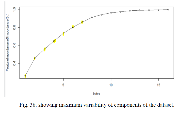
In Model 2 also we will first import the dataset and then split into Training and Test set. Now next thing we have to get the number of Components required to build PCA. Which is obtained here by Plotting the graph for showing variability between the component of the dataset. Fig. 38. Clearly shows also highlighted with yellow the component from 1 to 7 constitutes around 80 percent of the variability of the data and then it became constant. So we can use only 7 component for our model building.
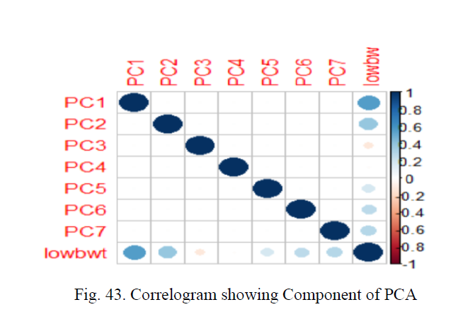
We have also plotted Correlogram to visualize the corelation matrix which will be showing the component of PCA and they corelation. From Fig. 43 we can see the components are positively corelated as its blue in colour.
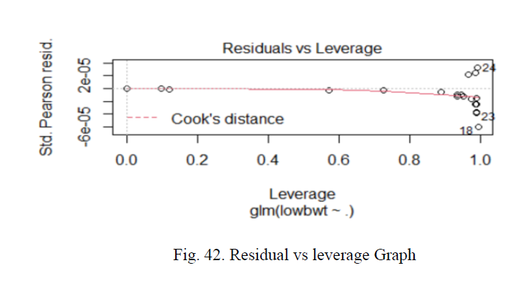
we have implemented the final Logistic model with PCA implemented and we have used seven components in our model which in total contributes about 80 percent of the variability in whole dataset after that it became constant. We have also plotted the Residual vs leverage graph in which. The residuals should not change as function of leverage. We can see no points lies outside the cook distance line which is dashed red line
Project 3:1 Implementation of Business Intelligence and Business Analytics Suite in E-Commerce Segment for OLIST Organization in Brazilian Marketplace
Economic Projection Dashboard:
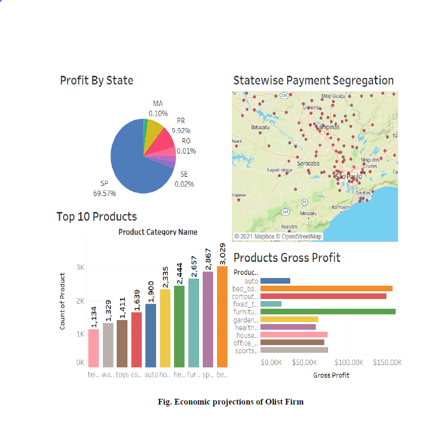
The Dashboard which we have build demonstrate the economic projection of the Olist Firm.We have Implemented Tableau as our Visulization Tool and Dashborads which we have build is interatctive also,we have used Highlighter and actions functionality of Tableau to highlight specific feature.The Economic Projection shows the Areas where Olist as a company should Focus and can get more Profits.The Dashboard in Fig below is explaining about the same. The Pie chart show profit by states and the state Sao Paulo contributes highest profits to the company which means they have a loyal customers in that aprticular regions. It nearly contributes to 69.57 percent,so as a Recommendation to a company we have asked Olist firm to foucus on other states from where also there can be potential customer which can be recognized by Dynamics 365 which we have implemeneted as aprt of Customer Relationship Management.Bar graph Plotted in the dashborad shows Top 10 products of Olist E commerce website, and it can be clearly seem Bed and bath table is most selling Product with 3209 product sold in month, followed by sport_leisure with a count of 2867. From the Top 10 catageories bar graph we have proposed to company that we can give discount or offers on the 2 highest selling Products which are Bed table and Sports leisure along with these products we can offer other products on less price which are least sold in Olist Ecoomerce websites.The next bar graph explain product gross profits from various product and we can see it clearly that bed table is highest gross profitable Product as its highest selling product which is explained in Top 10 catagories.
Customers Insights:
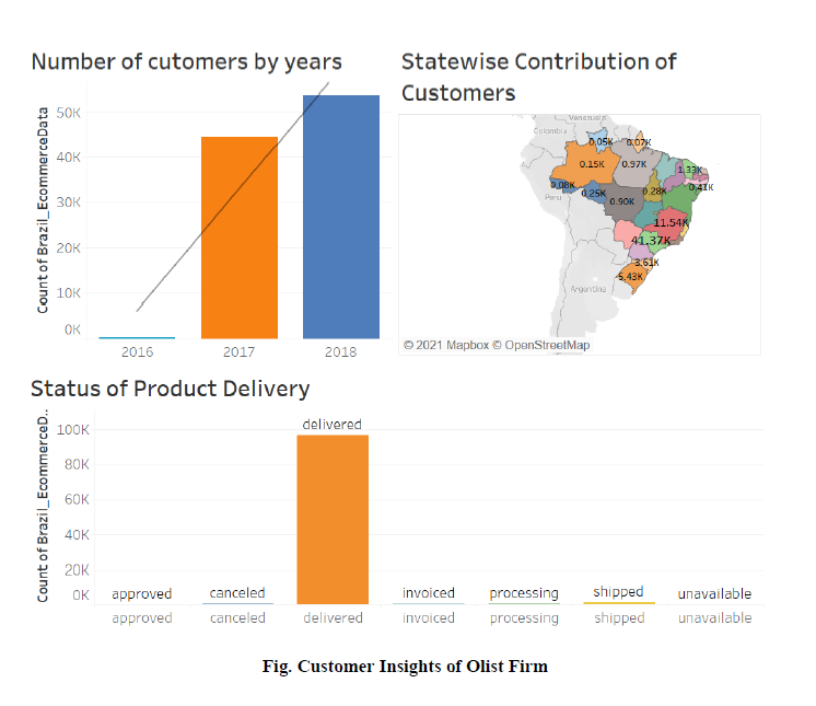
The next Dashboard Gives information regarding Customer Insights.The First Bar Graph represents no. of customers by years like we can see in year 2016 we have less customers but there was a huge surge in the year 2017 which got increased from to 44,000 and then in year 2018 we again see huge margin increment in the no of customers of about 15000 customers.So already we can see lot of people start using E commerce websites for there buisness.We have also plotted the Demographic map which shows state wise Contribution of Customers and this Map tell us that Sao Paulo has highest no of customers in the year 2017 with count of 17.52 K customers, which finally got increased to 23.74 k customers in the year of 2018.As the Dashbiard is interactive we can see no of delivred product is also changing yearly.Also we can see delivered item also got increased which was natural as the no of cutomers got increased. We have also plotted Regression line in witn adjusted R Square 87 percent and the p value of 0.27 which is less then 0.5 means we are nearly correct in our Analysis.
